Visual timelines
Motivation
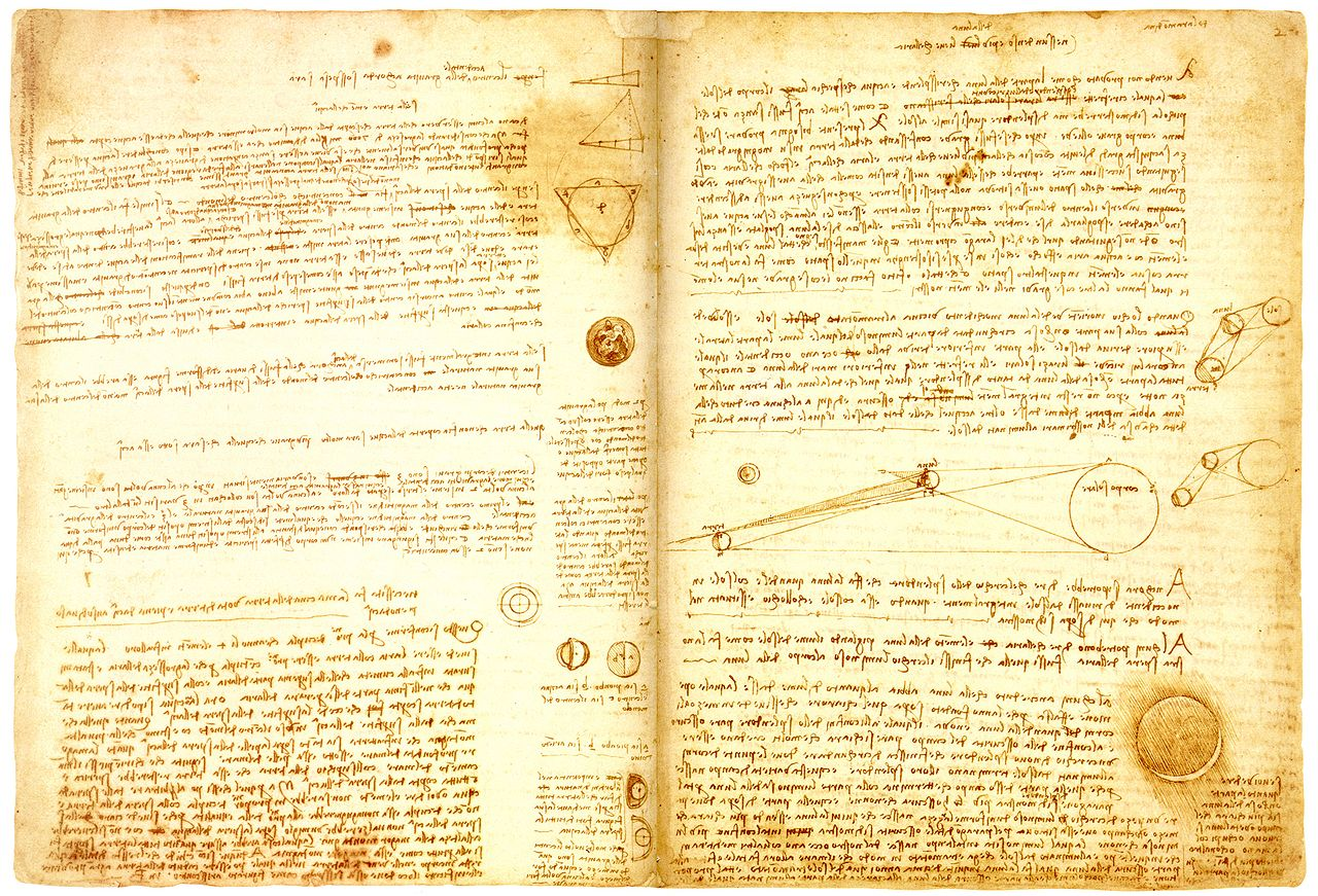
Given a page of written content, its structure is pretty apparent. You can easily scan the page and read the parts which seem interesting to you. (Unless it’s written by Leonardo da Vinci, duh. But you get the idea.)

For a video, this is different. You can’t see the structure, because you can only look a single frame at a time.
For example, try to find the scene where the bomb explodes in the following video:
Did you find it? Was it easy?
I think it feels a little like stabbing in the dark. The slider at the bottom just seems terribly inefficient to me.
The solution
I propose adding color information to the slider, to show the structure of the video.
Again, try to find the explosion - but this time, click around in the bar below the video!
(You find pause and resume the video by clicking it.)
Here’s another example. Can you find the scene with the elevator?
I call user interface elements like these visual timelines. Let me show you why they are awesome and how they work!
Why are visual timelines cool?
There are several cool things which happen when you have a visual timeline to navigate a video.
For example, you can suddenly see the intro and the credits of videos:
… and even if there’s a “secret scene” after the credits!
In a recorded talk, you can see when the slides change:
In a talk, you can also differentiate sections and see where the Q&A begins:
And sometimes, you can get a feeling for the arc of suspense of a movie, just by looking at the color development:
How are these images created?
- Take frames from the video at regular intervals…
- scale them to a width of 1 pixel, averaging the colors…
- and append all of them to one single image.
The result gives you an impression of the color development over time, and you can also differentiate between up and down.
There are many other styles of visual timelines which could be interesting. For example, here’s one visualizing the audio track of the video, using a spectrogram:
Footnotes
This work is in the spirit of Bret Victor’s essay Up and Down the Ladder of Abstraction. Visual timelines are an example of an abstraction over time.
I take much inspiration from the Explorable Explanations community.
My Story
In early 2011, I came across the moviebarcode tumblr. The people behind it take feature films, and create similar images depicting their color development. I had fun doing quizzes with some friends – we would show each other three of these images, as well as the movie titles in a random order, and the others had to assign the images to the titles. To my amazement, we managed to recognize Gandhi (1982), soley by the black intermission in the middle of the movie.
And that’s when I thought “huh, wouldn’t it be awesome to use these for navigation”? Now, supported by the Prototype Fund, I’m able to work on this vision properly!
Comments?
Send a message to @blinry@chaos.social or drop me a mail at mail@blinry.org.